- https://stackoverflow.com/questions/25571882/pandas-columns-correlation-with-statistical-significance/49040342
- https://joomik.github.io/Housing/
load_boston to provide the Boston housing dataset from the
datasets included with scikit-learn.
Correlation matrix
The correlation matrix lists the correlation of each variable with each other variable. Positive correlations mean one variable tends to be high when the other is high, and negative correlations mean one variable tends to be high when the other is low. Correlations close to zero are weak and cause a variable to have less influence in the model, and correlations close to one or negative one are strong and cause a variable to have more influence in the model.Format with asterisks
Format the correlation matrix by rounding the numbers to two decimal places and adding asterisks to denote statistical significance:Heatmap
Heatmap of the correlation matrix: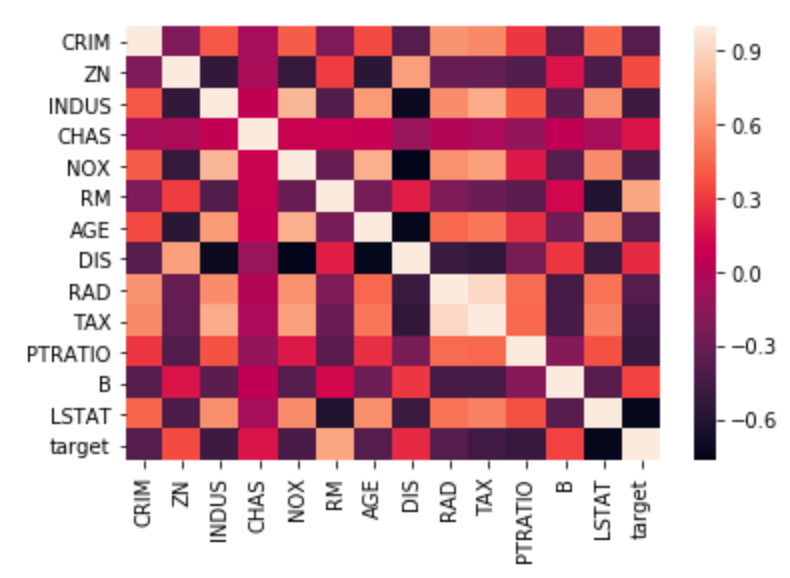
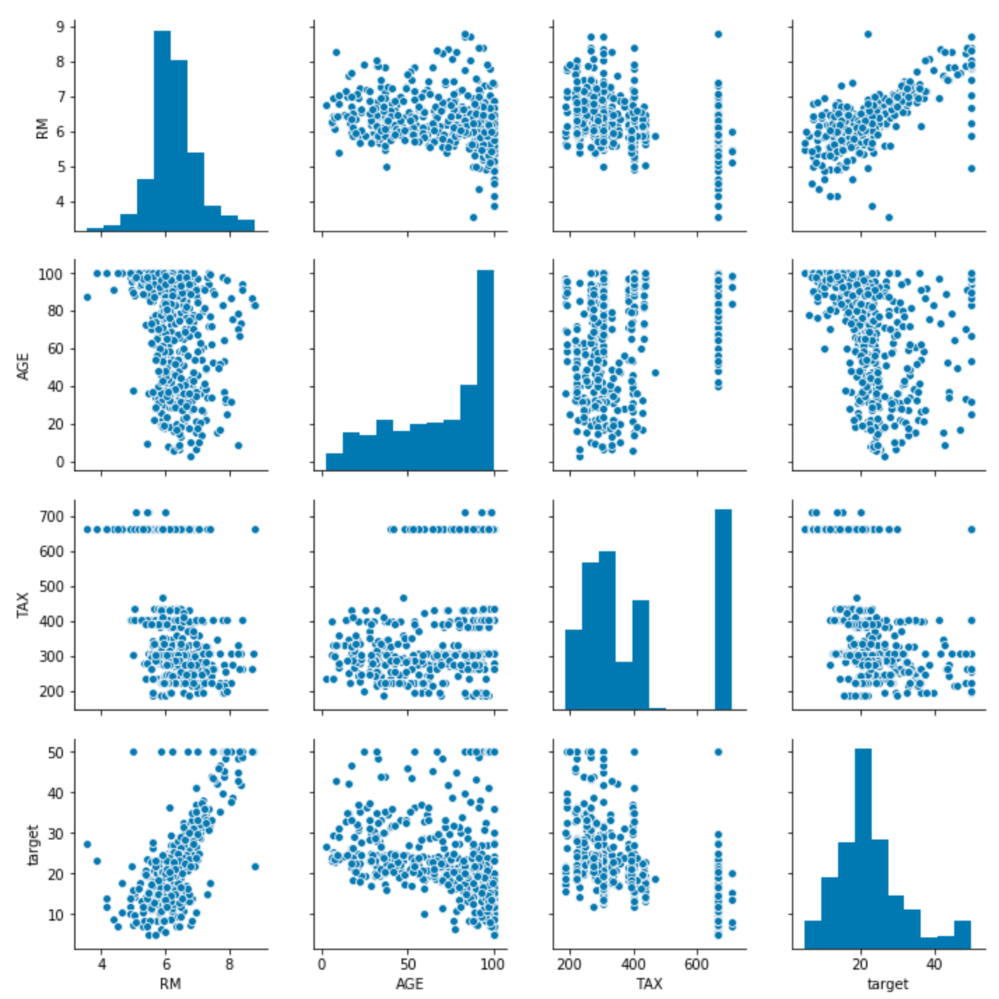
Pairwise distributions with seaborn
Target variable distribution
Histogram showing the distribution of the target variable. In this dataset this is “Median value of owner-occupied homes in $1000’s”, abbreviated MEDV.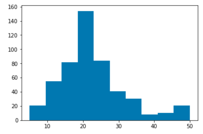
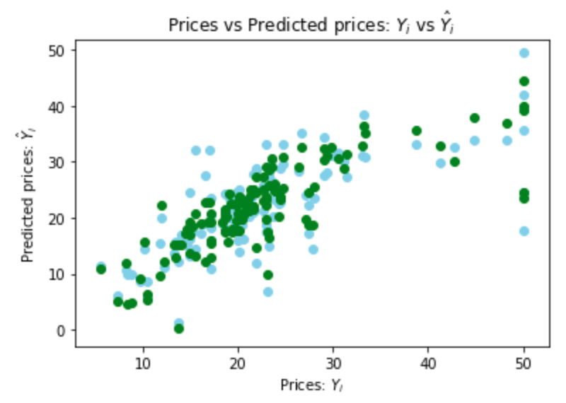
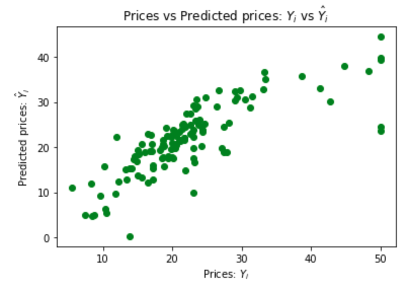
Simple linear regression
The variable MEDV is the target that the model predicts. All other variables are used as predictors, also called features. The target variable is continuous, so use a linear regression instead of a logistic regression.fit calculates the coefficients and intercept that minimize the
RSS when the regression is used on each record in the training set.
Ordinary least squares (OLS) regression with Statsmodels
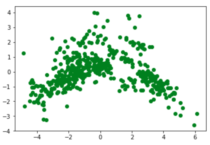
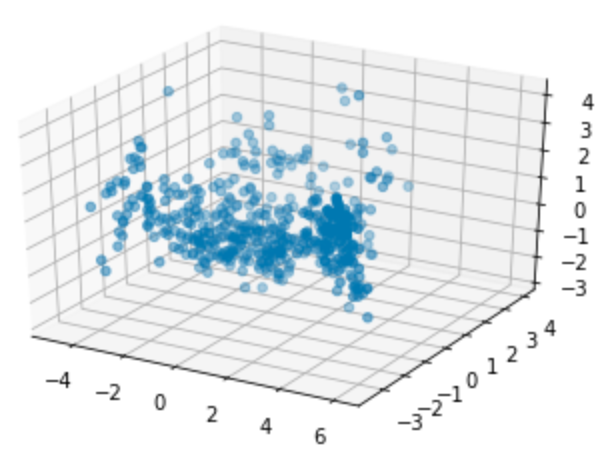
Principal component analysis
The initial dataset has a number of feature or predictor variables and one target variable to predict. Principal component analysis (PCA) converts these features into a set of principal components, which are linearly uncorrelated variables. The first principal component has the largest possible variance and therefore accounts for as much of the variability in the data as possible. Each of the other principal components is orthogonal to all of its preceding components, but has the largest possible variance within that constraint. Graphing a dataset by showing only the first two or three of the principal components effectively projects a complex dataset with high dimensionality into a simpler image that shows as much of the variance in the data as possible. PCA is sensitive to the relative scaling of the original variables, so begin by scaling them:
Show a 2D graph of this data: